Services

OOH Advertisement

Location

London, UK

Year

2025

Company

OOOSCH

OOOSCH

OOH Advertisement

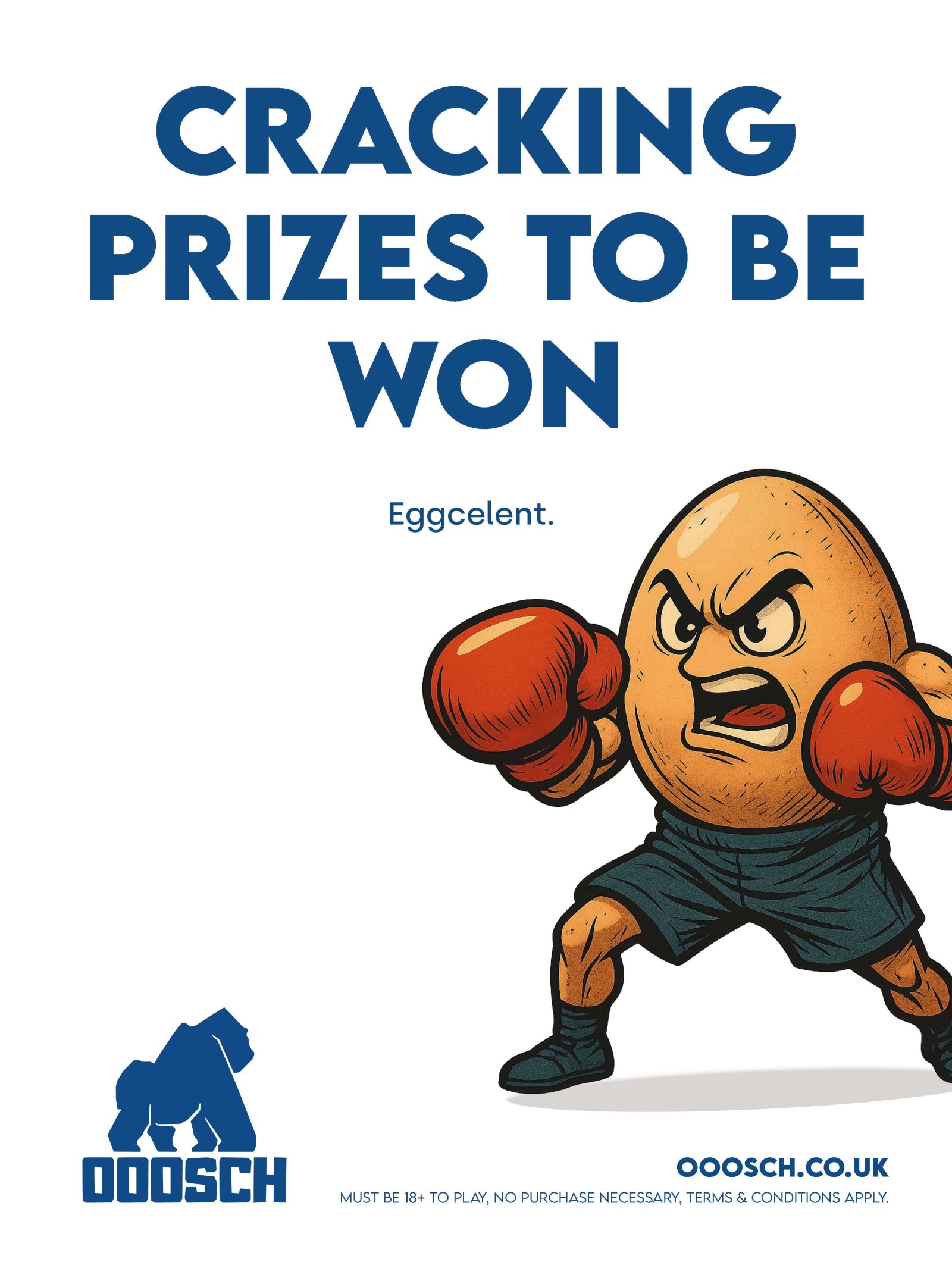
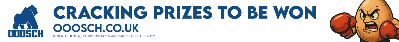
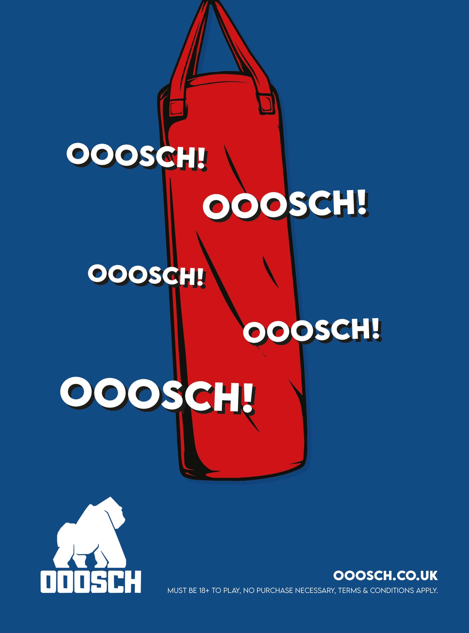
Making noise where it matters - London, meet OOOSCH!

OOOSCH, a prize-driven ticket raffle brand, needed a high-impact outdoor campaign that could cut through the visual noise of London transit and engage commuters quickly. The goal was to boost visibility and communicate the excitement of the prize experience across various ad formats.

  • Creative concept development
  • Visual design and hierarchy
  • Production-ready artwork for large format
  • Format adaptation across multiple media

Buses

OOOSCH! On the Move

Taking over London, one double-decker at a time.

Bold, bright, and impossible to miss - our bus sides turned everyday commutes into rolling hype machines. Running across key routes from North London down to Waterloo, these buses carried OOOSCH’s energy through some of the busiest parts of the city. Wherever people travelled, OOOSCH was right there with them.

The Tube

OOOSCH! Underground

Taking the next stop on your journey… straight to winning.

OOOSCH hit the Tube with high-impact station placements at hotspots including King’s Cross St Pancras, Camden Town, and London Bridge. These bold, eye-catching visuals cut through the commuter rush, delivering OOOSCH!’s message with clarity and attitude: big prizes, big energy, and your chance to win - right under the heart of London.

Escalators

Rising Up With OOOSCH

Escalators built for elevation… and temptation.

Our escalator panels turned every step into anticipation. Clean layouts, punchy messaging, and bold colour blocking delivered constant hits of OOOSCH energy as passengers moved through the station. No matter which way you were headed, the prizes were unavoidable.

The Solution

I developed a campaign language built around oversized typography, high contrast colour blocks, and simplified messaging designed for rapid comprehension.

  • Strong typographic hierarchy
  • Maximum visual impact with minimal elements
  • Adapted layouts that work for horizontal and vertical formats

Design Variants

Cracking Prizes to Be Won

A cheeky nod to that eggy moment.

Playing on the viral Eubank Jr vs Benn egg slap, this concept brought humour, hype, and knockout-level attention. Bold graphics and sharp copy made the design instantly memorable - injecting OOOSCH's attitude into one of boxing’s most talked-about moments.

Ooosch Stairway Lift Escalator Panels FINAL 05 Oooosch Bus Sides FINAL 01

OOOSCH OOOSCH OOOSCH

That winning feeling - loud, proud, unmistakable.

This design pushed pure adrenaline. Repeated typography, punchy compositions, and bright colour hits created a rhythmic, chant-like energy that mirrored the excitement of winning. The kind of visual that doesn’t just catch your eye - it buzzes through you.

Ooosch Stairway Lift Escalator Panels FINAL 04 Oooosch Bus Sides FINAL 02

Hit Hard. Win Big.

OOOSCH. OOOSCH. OOOSCH.

Using a close-up boxing bag visual, this version delivered a gritty, powerful tone. Strong textures, bold shadows, and heavy-impact type gave the design a fight-night intensity - aligning OOOSCH with the thrill, force, and focus of competition.

Ooosch Stairway Lift Escalator Panels FINAL 02

Result

The campaign was successfully deployed across multiple high-visibility locations in North London. Feedback highlighted the work’s ability to demand attention and communicate a sense of fun and urgency. The project also contributed to further engagement with the client on visual communications.

Nick understood exactly what OOOSCH needed: Energy, attitude, and impact. The campaigns he delivered across buses, Tube stations, and digital formats helped us reach new audiences and build a recognisable presence across London. A brilliant collaborator and a genuinely talented designer.

Rob Head of Marketing

OOOSCH

End quote